Add a custom button to Outlook Express (OE)
and Windows Mail toolbar in C#, VB.NET, C++
|
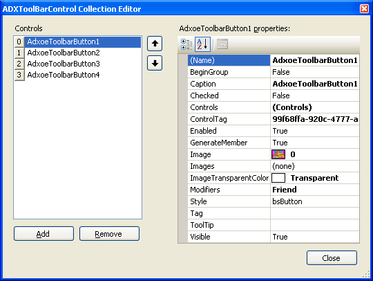
Add-in Express™ Add-in Express Home > Add-in Express for Outlook Express > Online Guide > Creating custom Outlook Express toolbars Custom Outlook Express toolbarsAdd-in Express gives you an easy way to create a custom toolbar for Outlook Express and Windows Mail add-ins in C#, VB.NET, C++. To do this, you right-click the design surface of the add-in module and choose an appropriate Add-in Express component in the context menu. There are two toolbar components available in the context menu: Explorer Toolbar and Inspector Toolbar. Essentially, they work on the same principle. As their names suggest, these components add a toolbar to the Explorer window or to Inspector windows. They provide the ButtonImageSize property that allows specifying the actual image size for all buttons on the toolbar: Small corresponds to 16x16, Normal - 24x24, and Large means 32x32 bitmaps. This property can be set at design-time only. In the same way, you specify the text position for all toolbar controls on the OE toolbar. As to customizing Outlook Express built-in toolbars, we are sorry but it is not possible in the current Add-in Express version. Outlook Express toolbar buttonsThe Controls property editor allows adding custom controls to the Outlook Express toolbar.
The controls are buttons, in fact. There are four Outlook Express button styles available for the developer: just choose a value in the Style property of a button component. Outlook Express toolbar button stylesThere are four possible values of the Style property.
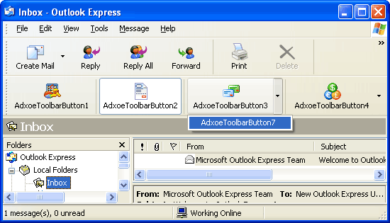
The following screenshot demonstrates four OE button styles in action:
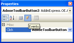
Processing custom toolbar buttonsThe only event provided by a button is Click. In the Properties window, use the combo box at top of the window to choose the button. Then, switch to the Events view and double-click the event of your choice:
This creates the event handler and opens the code window. Now you just write the code. |